Breaking the mowing addiction – let’s have some meadows.

Posted by Bruce Burns @BruceTracks

Why do we mow so much? In the city, our landscape norm is buildings set in areas of close cropped grass, and we are taught from an early age that regularly mowing lawns is the height of good husbandry (or wifebandry). But does it need to be so?

The mown lawn could rightly be viewed as an emblem of western civilization, and modern urban form owes much to the existence of lawnmowers. Regular mowing maintains open space around our buildings and roads and prevents ecological succession of those areas to weeds or forest. But there is a lot of lawn to mow – urban grasslands take up around 15 – 20% of Auckland (and other western cities) land area. There is also a cultural norm that seems to equate closely-mown lawns to tidiness, order, and care for urban human habitat. Mowing has become a regular activity for us, and we even instil a mowing ethos in our children with toy mowers.

meadow

Meadows in low-mow situations in Auckland provide multiple environmental and biodiversity benefits

But all that mowing comes at a cost, both real and opportunity. Publically and privately we spend millions of dollars and hours each year on mowing. Environmentally, mowing burns fuel and thereby contributes emissions to the air and pollutants to water. The opportunity costs can be estimated by considering what happens if we mow less and let lawns turn into meadows. Urban grasslands provide areas for stormwater infiltration and water retention – these ecosystem services are increased when grassland swards are deeper. As well, urban biodiversity would be enhanced. Meadow vegetation supports a greater diversity and abundance of plants, insects (including pollinators) and many other life forms. As well, wildflower-rich meadows would have psychological benefits for many urban dwellers, and they are stunningly romantic.

So, let’s experiment with setting aside areas within our cities and allow them to develop into meadows. I’m not talking about everywhere and not suggesting they won’t need some management. But I think we have a lot to gain by leaving the mower in the shed and valuing the nature that happens as a result.

bruceDr Bruce Burns is a Senior Lecturer in Plant Ecology in the School of Biological Sciences, University of Auckland. He is a plant community ecologist specialising in the biodiversity and restoration of natural, managed, and urban ecosystems.

Amazon Biodiversity Monitoring in Ducke Reserve

Posted by James Russell @IsldJames

Monitoring of biodiversity is a challenge, but visiting Ducke reserve in the Amazon I am able to see one of the gold standards for long-term biodiversity research. Satellite images reveal an oddly square 10 x 10 km forest block just to the north-east of Manaus. Here lies the Ducke scientific reserve owned by the National Institute of Amazon Research (INPA). My Brazilian colleague Carlos Abrahão undertook his early postgraduate research here and is keen to show me the reserve.

rIMG_1844-600x400

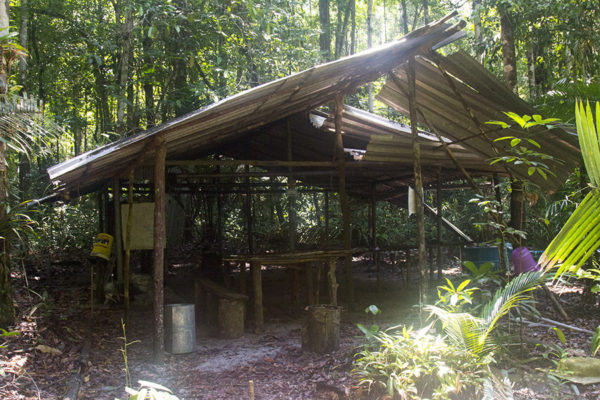
Our hike in to the central camp of the reserve is exhausting. Lying on the equator in the humid forest one only has to walk a few minutes before being drenched in sweat. As we navigate the linear track system turning at right angles appropriately, an afternoon thunderstorm threatens in the distance. As we nimbly traverse the last tree fall bridge of a stream we come upon the forest camp, and only minutes later the storm hits.

rIMG_1869-600x400

After making camp, stringing our hammocks up, darkness falls and the storm abates. Carlos takes this opportunity to eagerly search for the snakes he undertook his research upon. The best he can find is a tree snake, but for a New Zealander coming from a land without snakes, this is the perfect entry level snake for someone like me to let crawl upon themselves. Still, both I and the snake are happy when it is returned to the tree.

rIMG_1818-600x400

The perfectly square grid system the design of the RAPELD system imagined by INPA researcher Bill Magnusson. By dividing the scientific reserve in to consecutively larger squares, questions of importance to biodiversity managers can be appropriately matched to scale, whether it be the taxonomy of biodiversity in a tiny square, to forest dynamics across the entire reserve. Before entering the reserve Bill was generous enough to give me a copy of his book Biodiversity and Integrated Environmental Monitoring. It is a must-read for those interested in long-term biodiversity monitoring, especially as one lies in their hammock in the centre of the very reserve it focuses upon, listening to the cacophony of amphibians.

Originally posted on National Geographic Voices

Clever communication of ideas to generate interest in your research

As students and researchers working on long-term projects, we often have to wrangle with complex datasets. Producing thoughtful conclusions from such data is something we have been trained to do for many years. Likewise, our keen eyes have been trained to interpret conclusions when they are published within the scientific literature. But, the day will come when it is time to report information to audiences outside of the scientific community. The same jargon and quantitative results used to increase comprehension within scientific literature will likely decrease comprehension when reported to a general audience!

So, what is a solution to this problem??? My answer is to use….

snazzy visuals

Well… maybe not quite as snazzy as WordArt… but the inclusion of purposeful visuals will help audiences understand your message and also keep them engaged. Furthermore, a nice visual can always be added to a thesis or powerpoint presentation to help communicate your ideas effectively.

To bring this idea home, take a look at the images below:

databasepic

memePresenting your relational database to the general public will leave you looking like the over-caffeinated, sleep-deprived PhD archetype you are trying to separate yourself from (image: http://knowyourmeme.com/memes/pepe-silvia).

The first image is of my current relational database for invasive mammalian pests throughout New Zealand’s offshore islands. The second image is of how I’ll be perceived if I try to explain it to anyone else. Although informative, the database’s complexity makes it difficult for others to understand. The time required to explain its “in’s and out’s” will ultimately take away from the message I am trying to get across. As a solution to this issue, I decided to amend my database to ArcMap as a way of making it visual (see the picture below).

arcmap pic
An ArcMap image of New Zealand’s Hauraki Gulf. The different coloured polygons and data-points represent different features of the implemented database. I think we can all agree that this is much easier to explain than the other image!

Not only is it more interesting to look at, but the visual representation of my data clearly and concisely demonstrates what is going on (it’d help if I put a legend on the figure, though. Semantics.). Doing so has helped me spatially understand my dataset, too. instead of looking at lines of code, the visual form has provided context with which assist in the identification of geographic patterns.

zachpicZach Carter is a PhD student in the University of Auckland School of Biological Sciences. He is developing eradication prioritisation models to assist in the removal of invasive mammals from New Zealand. He is supervised by James Russell and George Perry.

Taking over at Huapai (and a very wet autumn)

Posted by Ben Cranston

Forest greetings

Out with the old and in with the new: a phrase which does not apply to long-term vegetation plots. Earlier in the year, I began taking the reins at one of the University of Auckland’s scientific reserves, Huapai, in the northern Waitakeres. Apart from my primary task at the site of implementing a droughting experiment on kauri (Agathis australis), I am also responsible for overseeing the continuity of long-term monitoring operations for projects past. On rare days when there is a spare moment to soak in the surroundings, I am still awestruck by the intricacy of Aotearoa ngahere urutapu (New Zealand’s virgin forest)…

IMG_0655

… The Tasman Tempest

Thanks to data provided by NIWA, I have at last found validation for making such claims as “the rain never stops on field days” and “mud is definitely soupier today than last time. Glad I insisted on the Wellies!” because many parts of Te Ika-a-Māui –Tāmaki Makaurau included- experienced their wettest autumns on record. Indeed, the winter up north was not as wet, but the trails never quite recovered from the “Tasman tempest” of early March making the, er, march up to the site always interesting.

NIWA Mar 2017

https://www.niwa.co.nz/climate/summaries/seasonal/autumn-2017

Epilogue

My outlook for spring is hopeful. The sky is already bluer, the ponga seem livelier, and though the mozzies are becoming a nuisance again, they are a welcome trade-off for fair weather. Soon the apparatus for the drought shelters will be fully installed along with the tree sensors and, as they say, we’ll be off the races on a first-for-NZ drought experiment. By summertime, the lab group will be faced with the new challenge of recruiting volunteers for tree-climbing days to take canopy-level measurements.